Other reality experiences like Augmented Reality, Mixed Reality, and Extended Reality provide users with different experiences. AR adds digital elements (often using the smartphone camera) to a live image. Snapchat lenses and Pokemon Go are examples of augmented reality. Real-world and digital objects can interact in a mixed reality experience (MR), combining AR and VR. Microsoft's HoloLens is one of the first mixed-reality devices.
What Is Virtual Reality (VR)?
Virtual reality (VR) is an experience that allows users to feel as if they are immersed in the simulated world. This can be achieved by using hardware, such as headsets and software. Designers create VR experiences e.g., virtual museums--transporting users to 3D environments where they freely move and interact to perform predetermined tasks and attain goals e.g., learning. It's important to remember the first-person viewpoint when designing VR experiences.
VR: Entering New Worlds Through Equipment

The goal of VR design is to allow users to experience a different existence by using the senses that your Design can reach. The more your Design reaches your users through particularly sight, hearing, and touch, the more immersed they will be in virtual reality. You want to isolate the users from the real world as much as possible.
The history of VR began in 1939 with the View-Master, a stereoscopic visual simulation. In 1950, Morton Heilig created his Sensorama theater for multi-experiences. In 1968, the first head-mounted display (HMD) was developed. Designers then focused on professional applications during the 1970s and 1980s. They could now tailor computerized VR to military training, flight simulation, and medicine fields. Virtual Reality entered the consumer market through video games in 1990, shortly after it became widely known as "Virtual Reality." Since then, VR has become increasingly affordable and sophisticated.
Virtual Reality vs. Augmented Reality vs. Mixed Reality

Virtual reality is a way to isolate users from the real world and give them a sense of presence in a virtual environment. VR differs from augmented reality, where the user remains anchored to the real world but experiences computerized overlays. Extended reality (XR) includes AR, VR, and mixed reality (MR), allowing users to interact with digital elements anchored in the real world.
AR uses devices (such as smartphones) to overlay computer-generated input on real-world elements (such as a room). Designers can insert digital elements like graphics and GPS overlays that adjust in real time to the changes in the user's environment (e.g., movement). In MR, the user has a more advanced experience, where digital content interacts with the real world for example, surgeons operating on their patients using projected ultrasound images. In VR, the user's real-world movement is fully translated into the preprogrammed environment, allowing them to play with convincing VR effects. So, in VR design, you offer users near-total escapism.
VR Designing To Dupe Senses
You can reach VR users in three different ways:
- Hyper-immersive, emotion-based, or inspirational designs.
- Live-action-style POV (first-person point-of-view) documentaries (e.g., exploring virtual rainforests).
- Games, gamified experiences and many more.
You must first understand users' human physiology, psychology, and limitations. Also, what makes VR enjoyable or unpleasant?
Focus on:
- Believability- Incorporate features (images and sound) to envelop users entirely in 3D environments.
- Interactivity - Make designs intuitive, and remove interference from outside the world. When you present brand-new environments to users, how they interact with them must be consistent with what they are used to in real life (e.g., punches still work).
- Explorability- Ensure users can freely move about and discover the "reality" offered.
- Immersiveness - By combining these factors, you can achieve your goal of inserting users in your Design.
You should always consider the following:
-
Safety and Comfort - Prevent virtual-reality illness (like motion sickness, but primarily from sensory conflicts/triggers in artificial environments). You want to immerse users in a virtually hermetically sealed environment. They can, however, become disoriented. The bodies of users are all different. The places they choose to experience VR are also different. They can fall or collide with things when they can move around freely. Safety is important, even though some devices, such as the HTC Vive, warn users of objects. Headsets can cause neck strains. Additionally:
- Allow users to see and use controls/menus.
- Don't change brightness or speed.
- Keep frame rates as high as possible.
- Minimize peripheral movement - users typically have 180-degree vision.
- Interaction - Design ergonomically to accommodate users' natural movements. Sensors and controllers must be dynamic for head-tracking systems, motion-tracking systems, and (possibly eye-tracking). This means they must provide instant control, consistent with real-world behavior. Place key interactions within the 50-70 cm range of users' arms.
- Image Scale - Prevent eye strain and aid user orientation using depth perception. Your visuals will change as you approach them. Use eye-catching text. Focusing distances that are comfortable range from 0.5-20 meters.
- Sound - Use sound to create atmosphere and give the user a sense of where they are in an environment.
The more VR becomes mainstream, the more people expect to be transported into new and exciting experiences.
3D Experience And Conventional Design

Over the last few decades, the market has provided designers with many examples of reliable work. Now it is moving towards a new paradigm for vivid 3D content. The VR experience will be dominated by sound, touch, depth, and feeling. Even the most innovative 2D screen experiences will feel dated and tired.
VR offers many benefits of physical training but without safety risks. The subject can remove the headset or change the settings to make the experience less overwhelming if they feel overwhelmed. For this reason, certain industries, such as healthcare, the military, law enforcement, etc., should prioritize using VR to train their employees.
Imagine Skype for Business on steroids. VR can bring together digital workers in virtual meetings and conferences. Real-time coverage of events will be available, similar to Facebook Live. You won't just be able to see the other person on screen; you will feel like you are with them in the same space, even if they are miles away.
Imagine how you interact with a touchscreen today. We all have examples of how we interact with touchscreens. For example, swiping to zoom and long-tapping bring up more options. All of these are things that should be considered in VR. As more creators enter the VR Solutions space, we are sure there will be more personalities who can create and test new UI designs, helping move the business forward.
Three elements make up the interactivity of virtual reality. Speed, range, and mapping are the three elements. The response time is called speed. It is an interactive simulation if the virtual world responds to user actions as quickly as possible. This is because the immediateness of responses impacts the vividness and realism of the environment.
Researchers have tried to identify the components and characteristics of Virtual reality's interactivity in various ways. To do this, designers must have a real-world understanding. This means that they should visualize the physical space around the user and then build upon the elements they've explored. It is important to avoid making your users feel uncomfortable or like they are invading personal space.
Virtual Reality Solutions, VR Solutions, Create AR/VR, Immersive Learning
What Kind Of Applications Are You Going To Create?
From a designer's perspective, VR apps are composed of two main components: interfaces and environments. Imagine an environment as a virtual world you enter after putting on your VR headset. It could be the planet you are on or the view of your roller coaster. Interfaces are the elements users use to interact with an environment and to control their experience. The complexity of the two components can determine how VR apps are positioned.
- The top-left quadrant is occupied by things such as simulators. For example, the roller coaster experience mentioned above. They have a fully-formed environment but no interface. You are shackled to the ride.
- Apps with a well-developed interface but little context are in the opposite quadrant. Samsung's Gear VR is a great example.
Start Designing Your Virtual Reality User Experience

Consider these questions before you begin designing your VR app:
- How do people get started?
- How can people be guided without being overwhelmed?
- Will you create a minimalist environment that doesn't overwhelm the user with choices, or will you err toward providing too much information?
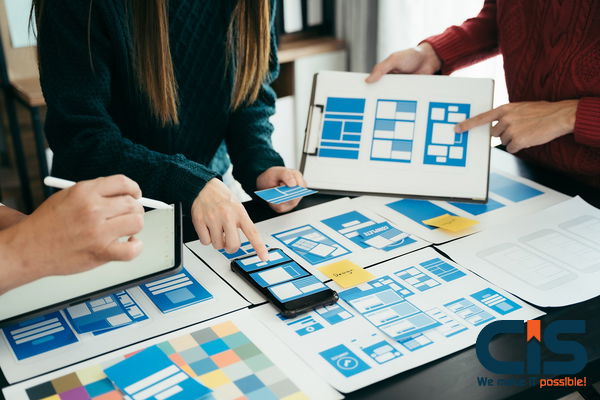
Do not expect people to be able to navigate and know where they are going. To help the user, you can use visual clues and software guidance. You should design for VR as much for the people's capabilities as for the system's. Understanding your users and any issues they may encounter while using VR is important. The process of designing a VR experience is similar to the design process for a mobile or web product. You will need wireframes, user personas, and conceptual flows.
Designing Virtual Reality User Experience

While most designers have defined their own workflows or design processes when designing mobile apps and VR interfaces, there is no global standard for these processes. To design your first VR application, you should begin with a strategy.
User Research Inside VR
Before you begin structuring VR, it is important to determine what type of experience you want to create. It is only possible to have a single solution for some. The majority of ethnographic research methods are completely open in VR, such as:
- Client Interviews.
- Fly-on-the-Wall.
- Usability Testing.
- Touchstone Tours.
- Simulation Exercises.
- Shadowing.
- Participant Observation.
- Heuristic Evaluation.
- Focus Groups.
- Eye Tracking.
- Exploratory Research.
- Diary Studies.
Wireframes
As designers, we will iterate quickly, defining interactions and the general layout.
Visual Design
After the features and interaction have been approved, this is where we are. Wireframes are then crafted using brand guidelines. The Design Process of VR Apps would be similar to our normal Design Process, except for a few usability concerns.
Designing An Environment

Canvas Size
You must first determine the canvas size to apply mobile app workflows to VR UIs. Here is a flattened 360-degree view of the environment. This is known as an Equirectangular Projection. These projections are wrapped on a sphere in a 3D environment to simulate the real world.
The width of the projector is 360 degrees horizontally and 180 degrees vertically. This can determine the canvas pixel size: 3600 x 1880. It can be challenging to work with a large canvas. We can focus on one segment of the canvas because we are primarily concerned with the interface of VR applications. We can use expert research to isolate the area where it is most comfortable to view the interface.
The area of focus represents one-ninth of the 360-degree view. The area of interest is in the middle of the equirectangular picture and measures 1200 x600 pixels. Let's summarize: "360 View": 3600 by 1800 pixels, "UI View": 1200 x 680 pixels
Pencil & Paper
Putting your ideas down on paper before you start using any software is important. This is a cheap and fast way to express ideas. The software can take many hours. It is important to note that moving from sketches into high-fidelity in 3D can be much more expensive than in 2D.
You Can Also Download The Software
Others use the opportunity to learn about new tools. What engine you use to Create AR/VR app is what matters. You will need Unity or Unreal Engine to build a 3D video game. Cinema 4D and Maya, however, are used mainly for renderings and complex animations.
Read More:
How are AR And VR Used in Healthcare?
Design Principles: What To Think About
Text Readability
Due to the display's resolution, your crisp UI elements may appear pixelated. It will make it difficult to read the text and cause a lot of aliasing in straight lines. Avoid using large text blocks or highly complex UI components. How far we designed them to be seen. The optimal viewing distance for these screens will determine the size, density, and size of the content on the screen.
Distance-independent Millimeters are one millimeter a meter apart. It's an angle unit that follows a millimeter into the distance. Here's a concrete example. We have a screen layout in the upper left corner of this image. All our UI elements have been measured in dams. The layout is 400x480 dmms, and we applied it to three virtual screens.
These virtual screens are all intended to be viewed from different distances. These virtual screens will look the same from the same viewing distance. They will all have the same angular sizes, the text will be equally readable, and the buttons will be equally clickable.
Ergonomics
It's fun to imagine futuristic interfaces, like those in Hollywood blockbusters Minority Report or Iron Man. But these UIs are exhausting after a short time. These diagrams illustrate the range of motion zones that are comfortable for you:
Text neck syndrome (the pain felt after looking at our phones for long periods) is something we've all experienced at one point or another. Poor posture can put up to 60 pounds of pressure on your spine, depending on how far you lean. This can cause permanent nerve damage to your neck and spine.
Avoiding Simulator Sickness
Virtual reality brings a whole new set of physiologic considerations to design. Virtual reality can cause physical and visual cues mismatches, similar to flight simulators that pilots use for training. The mismatch between visual and physical motion cues can cause nausea, also known as "simulator sickness," when you think your body is moving but your eyes are not. It is important to understand the physiological effects and Design of virtual reality. These guidelines will help you create a successful app and avoid simulator sickness.
Brightness Changes
Be aware of sudden changes in brightness. Due to the screen's proximity and the user's eye, a sudden change in brightness can cause discomfort. This is like stepping from a darkened room to the sunlight.
Button Placement
Avoid placing the fuse button in close proximity. The best fuse buttons are big and sufficiently separated from each other. The user may accidentally select the wrong fuse button if multiple smaller buttons are placed close together. If several smaller buttons are placed close together, they should all require a click. Our interactions with VR platforms should be as intuitive and natural as possible.
Tools For Vr Experience Design

Sketch
Sketch to VR uses A-Frame, a tool that is also a plugin. Sketch to VR automatically creates a website using A-Frame, so you only need to design your sketch.
Google Blocks
Simple 3D geometry can be used to create a sense of depth and scale. Google Blocks can be used to prototype ideas if you own a Rift, Vive, or other VR device. You wouldn't show this to a real user, but it's a good way to get a feel for how your 3D world might look.
Photo
Photoshop allows us to use core image editing tools, such as pen and brush, to draw elements in 3D space.
Sketch: Designing Vr Apps

Set Up "360 VIEW"
First things first. Create a canvas to represent the 360-degree perspective. Create an artboard with 3600 x 1800 pixels in Sketch. Import the file, then place it at the center of the canvas. Use your own equirectangular backgrounds, but make sure they are in proportions of 2:1. Also, resize them to 3600 x 1800 pixels.
Set Up Artboard
As mentioned above, the "UI View" is a cropped-down version of the "360 View" and focuses only on the VR interface. Create a second artboard, 1200 x600 pixels. Copy the background we added to "360 View" and paste it into the middle of the new artboard. Do not resize! Here, we want to keep the cropped version.
Design The Interface
On the "UI View," we'll design our interface. For this exercise, we'll add a single row of tiles. Create a new row by duplicating the first tile.
Merge Artboards And Export
Drag the "UI View Artboard" to the middle of "360 View Artboard". Export the "360 View Artboard" as a PNG. The "UI View" is on top.
Test It In Vr
Drag the "360 View PNG" you exported into the GoPro VR Player window. Drag the image to see your 360-degree view.
Prototyping
We'll group screens by flow, describing each screen and drawing links between them. This blueprint will serve as the primary reference for the developers who are working on the project.
Virtual Reality Solutions, VR Solutions, Create AR/VR, Immersive Learning
The Conclusion Of The Article Is:
As a designer, this is the perfect time to begin improving our skills with Immersive Learning in order to help shape the future of Design and its important role in improving and enhancing the daily life of users of applications. The best thing about it is that design thinking and the ux methodology is still the same, focusing on the new principles of interactivity as described above.

